Refining our message and design
![]() Jake Goldman on
Jake Goldman on
More than two years ago, we overhauled 10up.com to reflect the company we had become. Conceived and built entirely in-house, we strove for an experience and aesthetic that would project the craftsmanship we offer our clients. More than two years later, we think the art direction and architecture has more than withstood the test of time.
Meet the new http://t.co/8Yh4wn5rmh. (DNS may not be ready everywhere.) pic.twitter.com/YNb3P3w1GG
— 10up (@10up) May 16, 2014
Over the last two years, our mission, message, and value proposition has evolved, presenting an opportunity to improve the way we articulate ourselves, in content and design. I’m happy to announce a site wide update that highlights our refreshed mission statement and improves the way we describe #team10up.
We think that our own story becomes most tangible when telling our project stories, so we’ve also taken the time to completely redesign our work portfolio. Our user experience and visual design team worked closely with internal stakeholders and engineers to craft a portfolio that is as visually stunning as it is functional, across screen sizes and device types.
Clarifying our identity
Previously, our story revolved around a slogan-like mission statement: “We make content management easy. Maybe even fun.” The sentiment remains a part of who we are, as we strive to create delightful experiences in a space that so often lacks delight, let alone reliability. Our new “headline” more concisely explains what we offer customers, and more accurately expresses the breadth of our focus and ability.
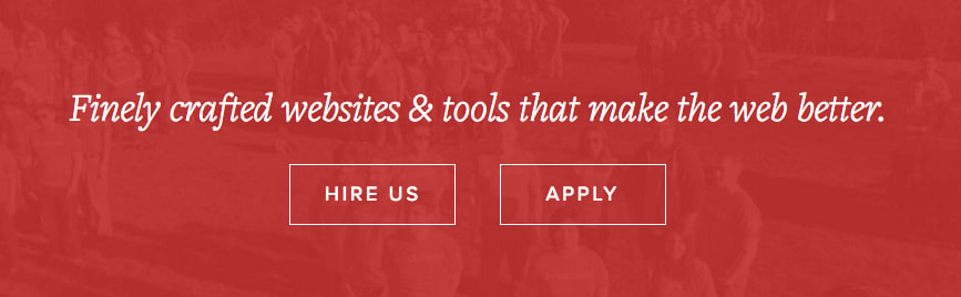
“We make a better web with finely crafted websites and tools for content creators.”
Our company overview has been similarly updated to better describe our work and value proposition, emphasizing the benefits of our service breadth and commitment to delivery excellence. 10up is taking ownership of making the web a better place for content creators and their consumers.
Presenting our work in a whole new way
Our reimagined portfolio presents projects in a grid that invites exploration, with subtle interactions designed for devices of all shapes and sizes. Empowered by greater backend editorial control, our designers have art directed visuals that look compelling everywhere they appear.
The new case study design features bold, curated imagery. By adopting a magazine-style two column layout for wider screens, we have reduced scrolling and increased readability without paring down content. A new layout, typography, and image presentation improve flow and support the content, rather than interrupt it.
Content is king
With a refreshed message, a new portfolio design, and a handful of other site design improvements behind us, we’re more excited than ever to refocus our attention on content and customer stories.