FanSided 250 Launches, Ranking The Top 250 Fandoms For 2019

Last week FanSided published its annual FanSided 250, the ultimate ranking of the 250 best fandoms in the world, from celebrities and movie franchises to sports figures and more. While my New England Patriots didn’t rank as high as I think they should have (anything less than #1 for us is a disappointment), I am ecstatic to be part of the 10up team that collaborated with FanSided to bring the bold new FanSided 250 website to life.
“We’re thrilled with the look and feel of the FanSided 250. Working with 10up has been an extremely rewarding venture. Every aspect of the experience has been upgraded from previous years, and the FanSided 250 has never looked and operated better.”
—Michael Dunlap, VP of Corporate Communications & Business Development
Putting Our Fandom To Work
A fandom is a community built around the shared enjoyment of an aspect of pop culture, where creative expression and artistic production by participants are encouraged. 10uppers identify with many different fandoms, from Star Wars and Marvel to Super Smash Bros., Stranger Things, and the U.S. Women’s National Soccer team (USWNT), but as a company, we’re fans of meticulous strategy, design, and engineering, all of which came into play for the Fansided 250 website project.
After working with FanSided on an ElasticPress consulting project, 10up was engaged to reimagine the user experience and design of the FanSided 250, formerly called the Fandom 250. The original site, using a muted grey and dark blue palette, didn’t deliver the impact or results FanSided hoped for. As a result, FanSided was looking for a new, bold design to not only capture attention, gain traction, and drive traffic to their site, but reflect and highlight the boundless energy and enthusiastic loyalty of fans.

Comparing the old Fandom 250 site (left) with the new FanSided 250 site (right).
With a clear design and strategy brief and a focus on creating a premium, high-end yet fun and engaging site design, our team followed a hybrid UX and visual design process that brought concepts to life and achieved design approval quickly. During the process, our team worked with FanSided to solve critical user experience challenges, such as:
- How visitors will navigate through fandoms, from scrolling through lists to jumping through the list to easily get from 250 to 1 — including an innovative “scrollwheel” that appears only when visitors stop scrolling;
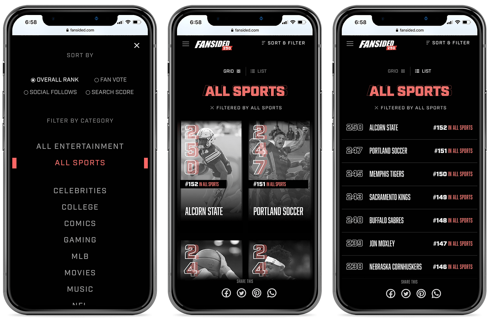
- How results will be displayed when filtering by topic and category;
- How content scanability and sharability can be increased; and
- How to do it all in a fast, intuitive, elegant way, particularly on mobile, where a majority of fans will visit the site.
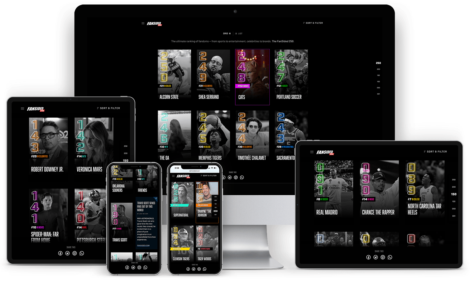
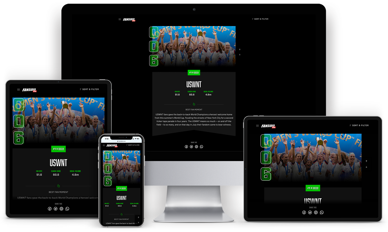
The result is an eye-catching site that organizes content by ranking and topic, provides visual cues with bold color, displays the results in grid or list format, and gives each ranked fandom its own dedicated page — including a photo, rankings, and a short description — that can be easily shared across social media platforms.
- Purposeful interactive animations create a premium user experience, adding delight and ease to the experience of browsing the fandoms.
- Infinite scroll makes it easier for fans to browse the site, find their favorite fandoms, and discover new ones.
- Topical cards strategically sprinkled throughout the FanSided 250 rankings drive fans to the main FanSided website to get more information on particular fandom topics.
- Filters enable visitors to view the rankings by overall rank, fan vote, social follows, or search score, by broad topics such as entertainment or sports, or by narrow topics like celebrities, college, comics, gaming, MLB, movies, music, NFL, NHL, pro basketball, soccer, sports figures, and television.

As the FanSided 250 is only updated once each year, there was no reason to invest valuable resources into the build of a custom content management system admin experience. Unafraid of pushing the envelope, FanSided’s engineering team proposed using a static site generator to provide added speed and an extra layer of security. We built the site as a headless front end with Gatsby.js, an emerging React-based JavaScript framework, and performed thorough testing to ensure the site loads quickly and performs beautifully on devices of all sizes — even under high amounts of concurrent traffic.
With the engineering complete, we turned the codebase over to FanSided’s internal team, who added the finishing touches, loaded in the content, and launched the highly anticipated site.

What About You?
Curious where your favorites rank this year? Check out the FanSided 250 and give your fandom some love on social media. Who knows, the buzz you help build may help your favorites move up the rankings next year!
Interested in learning more about collaborating with 10up on the strategy, design, and engineering for your next project? Let’s talk.
Want to work on projects like this? Come work with us.