Helen Keller International – Website Modernization
- Design
- Engineering
- Strategy
Attracting a New Generation of Donors With a Modern Web Experience
Thirty-nine million people worldwide are blind: eighty percent of those cases could have been prevented. Helen Keller International is dedicated to eliminating avoidable blindness, as well as malnutrition and neglected diseases. Guided by co-founder Helen Keller’s fierce optimism, the organization delivers life-changing health care to vulnerable families in places where needs are great but access to care is limited. Their vision? A world without barriers to sight, health, and human potential.
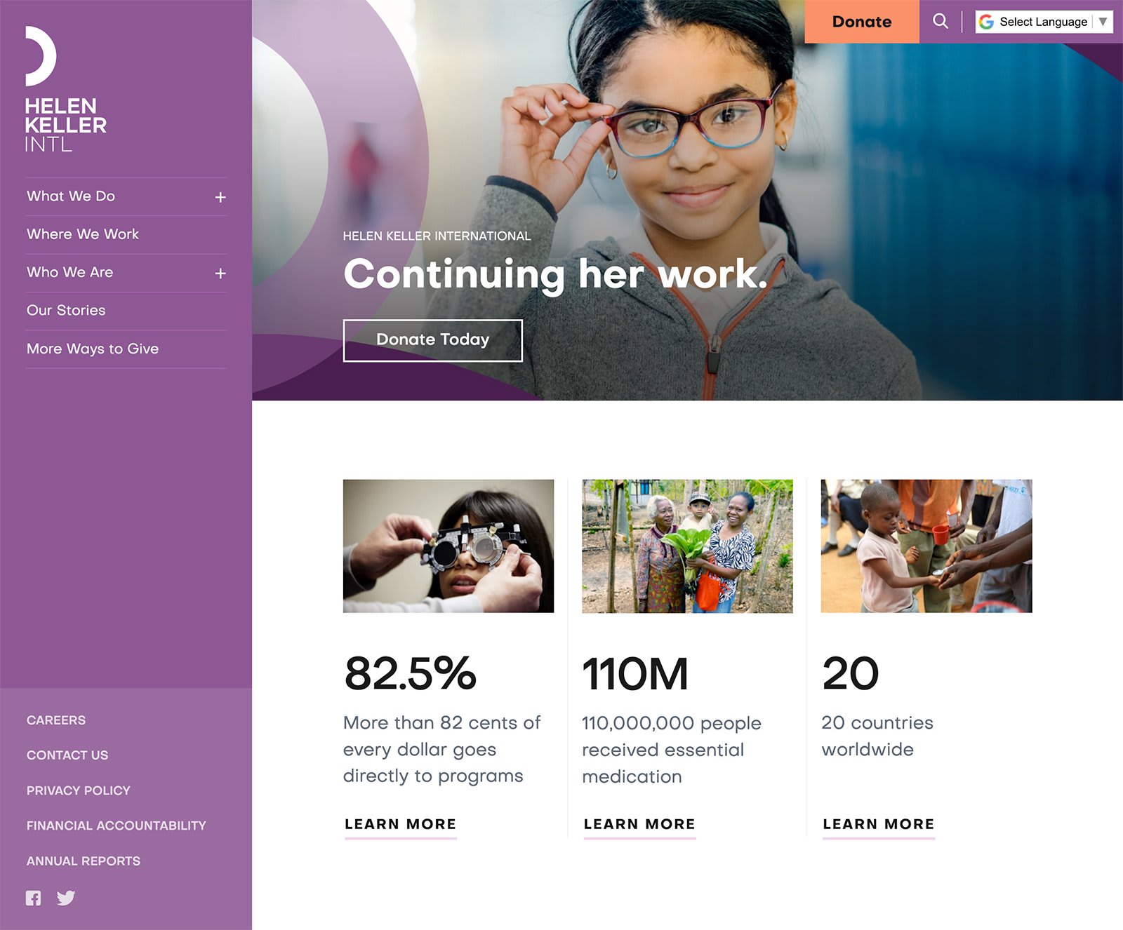
With a life-changing mission, moving stories, and powerful photography, Helen Keller Intl has everything it needs to create compelling content to inspire and mobilize changemakers around the world. Unfortunately, their cumbersome and limiting legacy Drupal website was holding them back. Without the ability to properly highlight visual content, feature stories, or tailor the design to support conversion goals and a streamlined user experience, they were missing valuable opportunities to boost audience engagement and donations.
That’s where 10up stepped in.

Gaining Design Clarity
A series of user experience and visual design workshops kicked off the website redesign process. 10up walked Helen Keller stakeholders through exercises that included extensive customer journey mapping — imagining how people move through the site to gather information or make a donation — and collaborative design evaluations, in which key leaders and managers involved with the project reviewed the designs of “best in class” websites in and out of Helen Keller’s vertical, and shared what they did and didn’t like, and why. The exercises provided a common design language that 10up used to establish a clear set of design goals that aligned with the technical requirements for Helen Keller Intl’s new site.
While a recent Helen Keller Intl global rebranding initiative provided a new logo design, brand typeface, and inspiring color palette, 10up expanded these elements into a flexible, cohesive visual system for the entire website. Now, whether a visitor enters through the homepage, a newsletter link, or the donation page, visual coherence and brand consistency deliver a unified experience that feels familiar and trusted, like the Helen Keller name.
“Thanks again for your relentless work ethic, expertise, and patience along the way. I’m sure Helen would be proud!”
— Andy White, Digital Communications Manager at Helen Keller International
Prioritizing Content Creation
The legacy site was an obstacle to strengthening existing donor relationships, attracting new donors, and reaching the next generation of donors.
- Administrators were unable to easily connect giving campaigns with the website.
- Content creators lacked the ability to publish visually captivating stories.
- Navigation menus were overloaded and unintuitive.
- Visitors found it difficult to find the information they were looking for.
To provide improved publishing capabilities, 10up leveraged the new WordPress block editor to provide a component-based design system. Helen Keller Intl can now embed multimedia, announce a new campaign, create interesting page layouts, and add crucial statistics to an infographic without ever engaging a developer or writing code.

To simplify the customer journey and make it easy for visitors to find vital content, 10up organized the navigation into easily understood sections such as “What We Do,” “Where We Work”, and “Who We Are.” The new “Our Stories” section created a place for Helen Keller Intl to share details about how donations are used — from providing mothers and babies medicine and meals in Sierra Leone to sending free eyeglasses to schoolchildren in New Jersey, each story shared gives people another compelling reason to donate.
The online donation process connects to Blackbaud Luminate, a third-party fundraising service. To maintain accessibility during the donation process, 10up styled the Blackbaud forms to match the design of the Helen Keller Intl site, built a custom content block for embedding accessible email opt-in forms, and installed advanced conversion tracking and page analytics to determine which buttons and CTAs performed best.

Providing Access for All
Helen Keller Intl welcomed 10up’s emphasis on website accessibility.
- As Helen Keller operates in twenty countries, an embedded Google Translate widget was added to support the native languages of its audience of partners, donors, and benefactors.
- The project targeted the Web Content Accessibility Guidelines, WCAG 2.1 Level AA level with accessibility improvements that included ensuring the entire site can be navigated by keyboard.

Using WordPress to Change The World
Upon completion of the site redesign, 10up provided Helen Keller staff website training and handed over the keys. Helen Keller Intl then added hundreds of pages of new content in preparation for the public website launch.
“Everything has been running smoothly these past few weeks. We’ve added around 150 pages of new content without any hiccups, and will be continuing the push for the next few weeks.”
— Andy White, Digital Communications Manager at Helen Keller International
A few months later, in January 2020, the new HKI.org site unveiled a revamped storytelling, navigation, and donation experience. The result was a modern website geared toward building lasting relationships with Helen Keller Intl donors and attracting a younger demographic.
“I want to send my exuberant thanks and appreciation to the gifted team at 10up. I have never had such a smooth and well-managed experience with a web development project and agency. All along the way, we knew we were in expert hands and you have been utterly professional and attentive throughout. Thank you again”
— Elizabeth Wright, Director of Communications at Helen Keller International
Continuing to Evolve HKI.org
Post launch, Helen Keller Intl digital leadership named 10up their ongoing support partner — sharing a long-range vision centered around continual iterations that support their evolving site content, users, and technologies.
Leveraging data and feedback gathered from front- and back-end site users since the relaunch, a new set of forward-looking goals were established:
- Defining measurable metric benchmarks
- Growing Helen Keller’s audience by melding historically direct campaigns with new opportunities in the digital ecosystem
- Making editorial adjustments to further improve time-to-site of content
- Modifying onsite search and styling to improve accessibility of anticipated content
Driven by expertise from Audience & Revenue Strategists, User Experience Designers, and Web Engineers, 10up is thrilled to have a hands-on role in Helen Keller’s continued digital evolution.

Making a Better Web
Inspired by their passion and enthusiasm, 10up created a powerful, easy-to-use website that helps Helen Keller International clearly articulate their story and share their life-changing work with the world.
Whether working with multinational enterprise companies or mission-driven non-profit organizations, 10up aims to make a better web with finely crafted websites and tools for content creators. To discuss how your enterprise can achieve its digital goals, contact 10up.
