Microcopy can make a macro impression
A newly hired UX Designer once quipped, “I could spend all day obsessing about word choices.” It’s true, we could! Those small fragments of text—a phrase, a sentence fragment, or even a word—can make an interface really work. We call it microcopy.
Microcopy sits unobtrusively alongside user interface, ready to provide contextual information for a user that needs that extra bit of help or information. It makes visitors feel confident and can help reinforce a client’s brand through tone and style. Typically you see microcopy near interactive elements. Here are some prototypical examples of microcopy found online:
- Status Messages: Google drive keeps you informed that your hard work is okay.
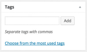
- Form Help: WordPress admin
- Forms: Hotels.com lets you know what you can search for.
- Expectations: BBC lets potential signups know that it won’t post to your feeds.
“Microcopy is small yet powerful copy. It’s fast, light, and deadly. It’s a short sentence, a phrase, a few words. A single word… Don’t be deceived by the size of microcopy. It can make or break an interface.”
— Joshua Porter, 2009
Microcopy’s impact on usability is often critically examined during a heuristic analysis (usability audit) done by UX professionals. Additionally, we can measure the efficacy of variations using A/B tests or gain insight into how visitors think about user interfaces with a focused user test. But microcopy also has the potential to enhance and reinforce a brand. Consider the tone and style of these microcopy examples from around the web:
- Usertesting.com’s language here reinforces one of their primary value propositions and language.
- Github speaks right to the visitor with this loading message.
- Cracked.com acknowledges how annoying logging in can be with it’s “remember me” checkbox.
- Foursquare shows deference to the visitor by using “Hm” and ending in a question.
In the momentum of a new project, we often overlook the support text. Much of our attention is focused on user flows, navigation, design, and functionality. But microcopy presents an opportunity for increased usability, branding, and perhaps a bit of delight. As part of ongoing usability testing and optimization, we recommend taking time to focus on microcopy. They may be small words, but they have a big impact on interfaces.


Speaking of UX, the input fields on this form are invisible. I thought the whole white area was an input field and the labels were placeholders, but when I clicked the placeholders (e.g. “Name”) nothing happened. I now see that they are not placeholders, and the actual field is to right, inside the white area and completely invisible.
Good point. We’ll fix that. :-)
Still not fixed/changed ;)
BTW, also the vertical alignment of the label and input spaces is off.