White House – Website Rebuild
- Engineering
- Interface Design
Delivering A World-Class Website Powered By WordPress For The White House
A Voice For A New White House Administration
With only six weeks before an Inauguration Day deadline, 10up set out to help give the incoming White House administration its online voice through a world-class website powered by WordPress.
10up was paired with the creative agency behind the Biden-Harris Transition website to consult on backend architecture and pair a new front-end design with intuitive editorial tools that would empower the new communications team with a truly exceptional visual editing and content management experience within WordPress.
Following the notion that content within the editor should visually mirror the content displayed for visitors, 10up built a visual block-based page editing experience that delivers visual parity between the front and back-end of the White House website.
Collaboration Across Remote Teams
Delivering a project of this magnitude in such a short timeframe required intense focus, close collaboration, and total immersion for every member of the team.
Senior Team Members
Designing, building, and launching the White House website in only six weeks required exceptional performance under pressure, which meant assigning senior-level team members with the right skill sets. With no time for a traditional, dedicated quality assurance (QA) or user acceptance testing (UAT) phase, there was no room for error — designers and engineers alike were expected to execute fast, require minimal revisions, and make smart decisions on the fly.
Daily Stand-Ups
Each day began with a team-wide daily stand-up. These meetings provided context for decisions, status updates, and a clear understanding of where elements stood across the project and how they intersected. When needed, these stand-ups also created opportunities to walk through designs, discuss functionality, and provide feedback.
Parallel Work
Design and engineering were tackled concurrently and iteratively. 10up’s initial engineering strategy and execution were informed by wireframes. Components were then styled and refined as high-fidelity designs took shape.
Distributed Team Advantage
10up leveraged its distributed remote work model to increase the daily output and speed of delivery. Engineers on the project, working in different time zones, stepped in to continue where colleagues left off. This approach required clear, concise communication during daily handoffs, explaining the context for what was done and why specific decisions were made, what needed to be done, the desired functionality, and the expectations of delivery.

Front-End First Approach
For the White House website, 10up owned the editorial experience, back-end engineering and architecture, and data layer, while the White House’s creative agency owned front-end design and development.
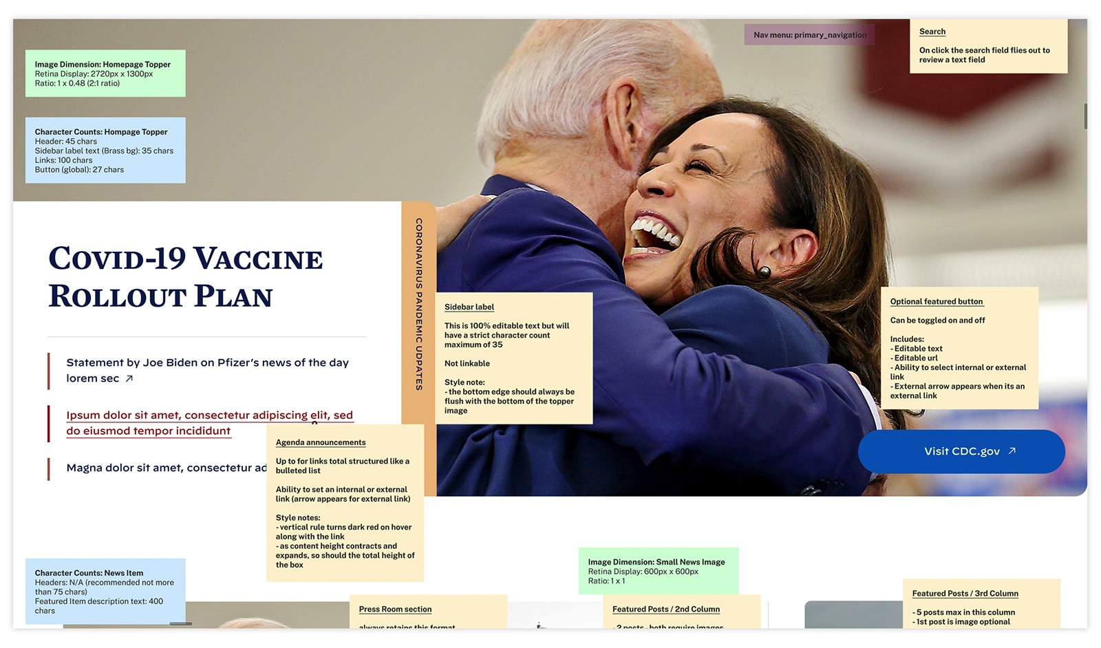
As high fidelity designs were completed, 10up engineers translated each of the website’s content elements to backend content blocks that could be arranged, configured, and managed in the visual page editor, identifying functional requirements and how to best handle the data.
- Once the built in (or “core”) WordPress blocks were identified — headings, paragraphs, lists, tables, quotes, and images — 10up stood up a test page using each core block.
- The White House’s creative agency leveraged the test page to rapidly design and style each block’s front-end appearance directly in the browser. As the design process exposed the need for additional block options or fully custom blocks, 10up created the editorial foundations for each addition and updated the test page.
- When each block’s front-end style neared completion, 10up began applying the block’s visual design to the editorial experience – taking care to reflect the block’s front-end appearance and functionality in its content creation implementation.
- Implementation considerations driven by the site’s content architecture and editorial requirements were identified and addressed as 10up built each block in the back-end editor, affording the Administration the opportunity to continue refining requirements late into the build process.

An Intuitive Editorial Experience
The new White House website provides an intuitive editorial experience that empowers the communications team to publish information quickly and effectively.
Creating a flexible editorial interface that didn’t overwhelm editors or make it too easy to break design patterns (or accessibility) required embracing the notion of decisions over options — reducing distractions and streamlining editorial tasks by, for one, removing unused blocks and features from the editor. It also meant going beyond the blocks already included in the WordPress editor, with an emphasis on letting the editors focus on content, not fiddling with design properties that add unnecessary complexity or lead to inconsistency.
For example, the native WordPress editing experience requires editors to move away from the visual page content to set the featured image, categories, and date in the editor sidebar.
- To simplify the content creation experience, 10up removed sidebar options in favor of new blocks for the featured image, category, and date that are displayed in the editor in the same position that they appear on the page.
- The new category block interface allows editors to select only one category and removes the ability to create new categories, ensuring content aligns with White House editorial guidelines.
- To ensure visual consistency, key options like the selected category inform constraints enforced by other blocks. Each page includes a required “topper” block, automatically inserted when a page is created, that varies its presentation based on the page’s category.
- 10up employed reusable editor components like image and link pickers to quickly assemble new blocks from existing foundations instead of attempting to create each custom block completely from scratch.
- 10up embraced built-in WordPress features like custom post types and role-based permissions to create distinct, access-restricted editorial areas of the site that align with the permissions required by the multiple Executive Offices responsible for maintaining the site’s content – eliminating the need for a convoluted, bespoke permissions system.
The result is consistency in page design between the design presentation layer and the admin editor. Now, the White House communications team can see exactly what content will look like as it is created within the WordPress editor — no more guessing.
Innovation At The Speed Of Politics
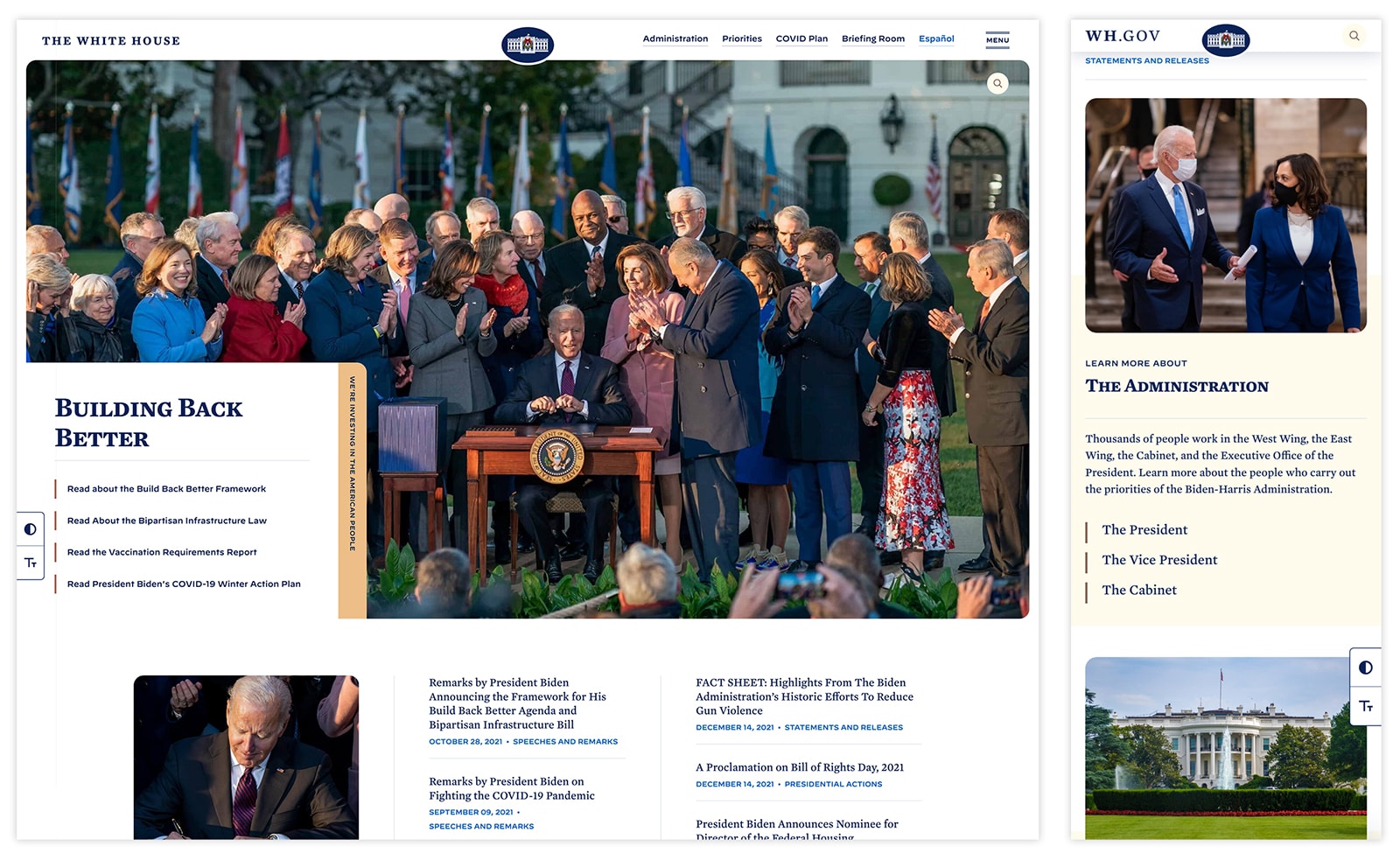
The new WhiteHouse.gov — the result of an immersive sprint with an immovable deadline of 12:00 pm Eastern Time on Inauguration Day — boasts a flexible, user-centric publishing framework designed to adapt to the Biden-Harris Administration’s online communication needs.
It is a shining example of 10up’s vision of finely crafted editorial experiences using WordPress in an enterprise content creation context.
