User Testing Gutenberg
![]() Sarah James on
•
1 Comment
Sarah James on
•
1 Comment
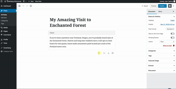
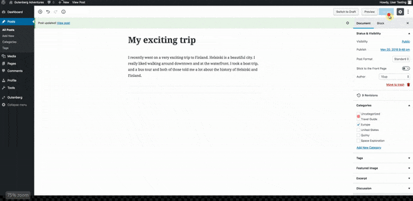
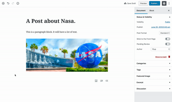
A new WordPress content editing experience—Gutenberg—is coming soon to WordPress core, and 10up’s User Experience team is eager to understand how it will impact the experience for content creators. As a starting point, I created a usability test to study the experiences of professional, digital content publishers who are used to writing stories in the current editor. Building on other Gutenberg usability tests that focused on re-creating a prescribed layout, I instead asked professional writers to produce the same kind of content they already produce every day: write a simple story.
The user test asked ten participants to complete the following prompt:
Write a news-style blog post about somewhere interesting you have visited. Please include the following elements in your post:
- A title
- A paragraph or two about the place
- An image
- An extra item such as a video or blockquote
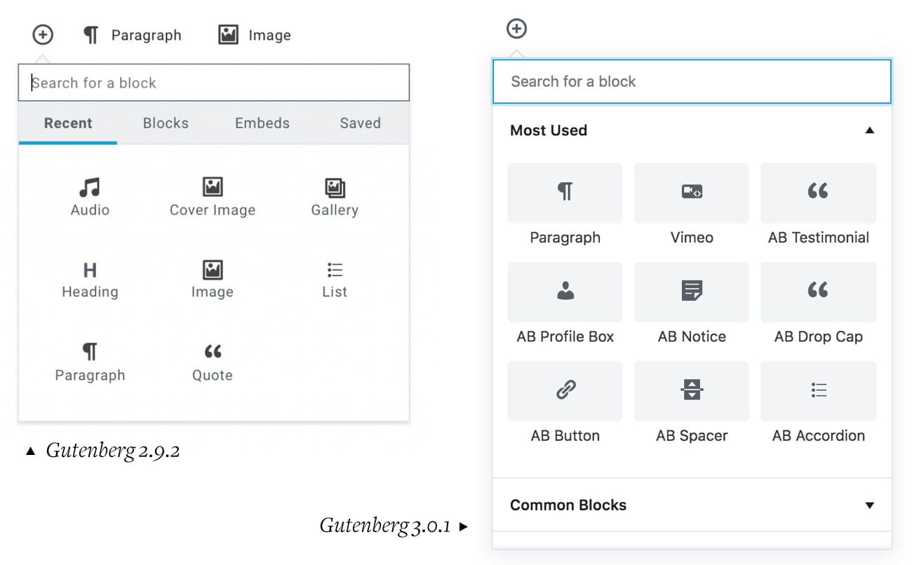
These tests were taken with Gutenberg 2.9.2 (the current build at the time the test was created). As of this post, the current version is 3.0.1.
During the unmoderated test, participants described what they were thinking as they progressed through the task. Their words and screen movements were recorded with permission.
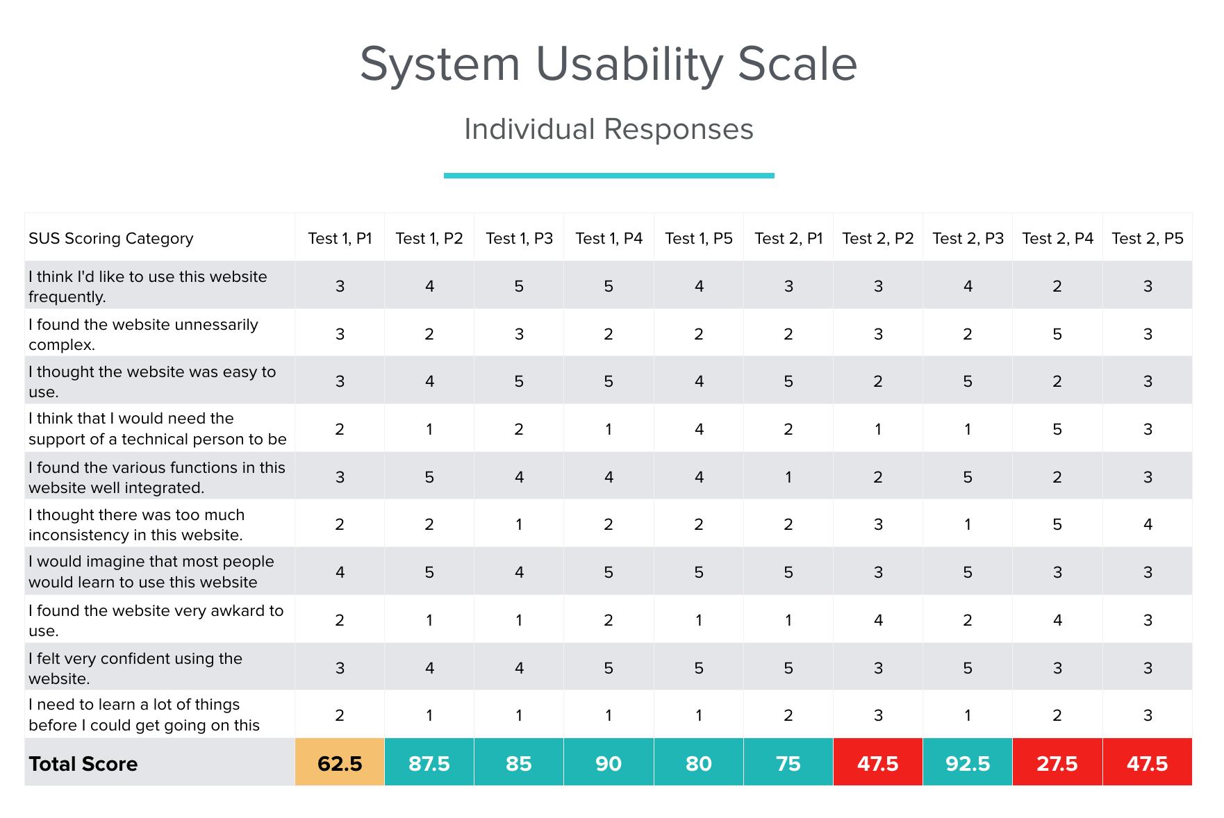
It’s worth noting that this test placed people who frequently create content with the classic WordPress editor into a wholly new experience without any training, and in general, people are averse to change. We gave participants a task we knew they could likely perform with ease in the classic authoring environment and wanted to understand how that experience would translate with Gutenberg. We compiled our results into a system usability scale, which provided a high-level understanding of Gutenberg’s overall usability, but did not tell the whole story. As so often happens, the observable behavior provided the most insight.
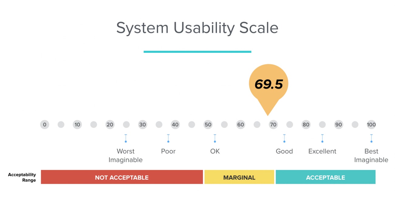
The weighted average of our ten participants gave Gutenberg a 69.5 on the System Usability Scale.
Positive Feedback
Overall, participants liked the look and feel of Gutenberg. Although they struggled with a few basic tasks, they understood and enjoyed the new authoring experience.
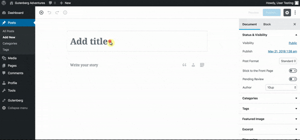
Tasks such as adding a title and paragraph which involve elements with clear and immediately visible prompts, were easy to understand and caused little friction. Participants immediately clicked on the title area of a new post and began writing. Participants commented that writing a post was easy and that Gutenberg “got out of [the] way.”
Pain Points
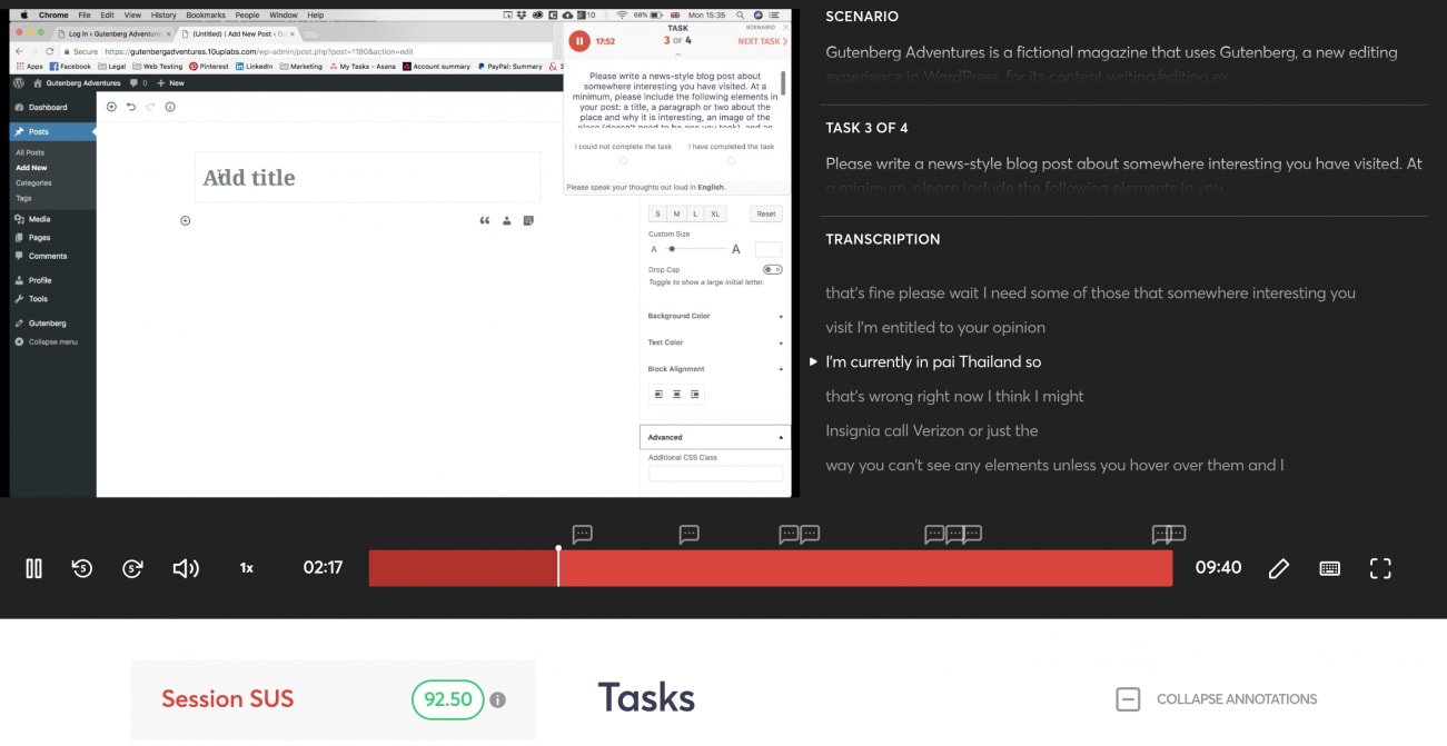
Although the interface is clean, a lack of focused attention or hierarchy on the page became apparent. Participants struggled to complete tasks like adding an image that did not have a clearly exposed and labeled element like the title and paragraph fields. Heatmap tracking of the backend captured 734 unique clicks in the new post interface and only 40 of these clicks were on actual clickable elements. This suggests a struggle to find basic interactive elements, such as image blocks.
The heatmap screen shows where test participants clicked in the authoring interface.
Participants also struggled to find and insert additional block types, such as images. We observed two different behaviors. First, participants tried to insert media from the toolbar above the space where they write, similar to its location in the current WordPress content editor. Second, they did not pick up on the intended visual cue that triggers the menu revealing the image and media blocks: the “+” symbol to add a block, shown both at the top of the page and when hovering over the content editor, was missed by several of our testers.
When writing [a] post for WordPress in a classic editor I had no problem inserting the pictures in a chosen place along the text. Here, I had problems inserting the picture anywhere.
In attempting to insert an image, one participant kept looking within the paragraph block to find an “add media” button. They ultimately used the only visible cue they could find: the media link on the left side of the page, which navigates to the media library, and away from the post (this was not the only participant who turned to the navigation on the left when trying to insert an image).
Another participant learned how to insert media by reviewing another post.
Once participants learned how to insert a block, they had no problem repeating the steps. So while there was a learning curve, once learned, it became second nature. As one participant said:
I could find everything I needed eventually, I think, but it took a bit of poking around at first. Now I know.
The Path Forward
While the clean design and clear labels moved test participants directly into basic authoring tasks, some additional visual cues may better support the inclusion of richer elements, especially embedded media, which is the goal of Gutenberg—to make “it easy to create rich post layouts.” Here are some recommendations based on our findings.
Better Expose Common Tasks
Participants easily added a title and a paragraph to new posts. Friction occurred when they needed to add other block types and layout elements. We recommend immediately exposing clearly labeled additional block types when starting a new post to make it easier for authors to include additional elements.
Gutenberg 3.0 does a better job of highlighting common tasks. Writers can expand multiple accordion lists to see all available blocks in a single place. The version we tested with used a tabbed interface, limiting writers to one subset at a time when looking for blocks.
Create Stronger Visual Cues
We know our participants were sent into this task with a handicap: they had never worked with nor seen Gutenberg in action. While some professional writers—especially those who work in large organizations or businesses—may be provided with training and onboarding resources, millions of WordPress users will come to try Gutenberg without training or previous exposure.
Given how often participants struggled to insert alternative blocks, we recommend stronger visual cues. Recent updates to Gutenberg have already moved in this direction by emphasizing the borders around existing blocks (as in the screen capture below); however, the insert block button is still less emphasized and can easily be missed.
We recommend creating a clearly labeled “insert block” button at the top left in place of the plus (+) icon.
Focus on the Authoring Experience
Gutenberg is clean and gets out of the way of writing. This is both a strength and a weakness. As one participant said:
Editing interface options seemed hidden at first…it was hard to tell where blocks started and ended because there were no bounding boxes or traditional form fields for guidance. I appreciate that the interface was clean, but it was TOO clean.
As with nearly all backend screens, the Gutenberg interface sits with the administrative navigation on the left side of the screen. Seemingly in desperation to find the way to insert media, some participants turned to the Media menu in that navigation. Collapsing this menu during writing for a complete take over of the screen could remove confusion for authors.

Movement tracking inside the new post interface. Participants frequently turned their focus to the right side of the page
WordPress users are increasingly being encouraged to try out Gutenberg; an upcoming minor release is anticipated to have a built-in call to try it, and the release of WordPress 5.0, slated to make Gutenberg the default editor, is on the horizon for 2018. 10up is committed to supporting WordPress by making its future authoring experience the best it can be. In addition to offering UX insights and tools, 10up is committed to including Gutenberg support in all of its upcoming public plugin releases, and we continue to update existing plugins for Gutenberg.
Did a nice job with this. I can see the two type of users.