Northeastern Student Life – Website Redesign
- Design
- Engineering
- Interface Design
A Playful, Easy to Manage Website Design Servicing Thousands of Students & Parents
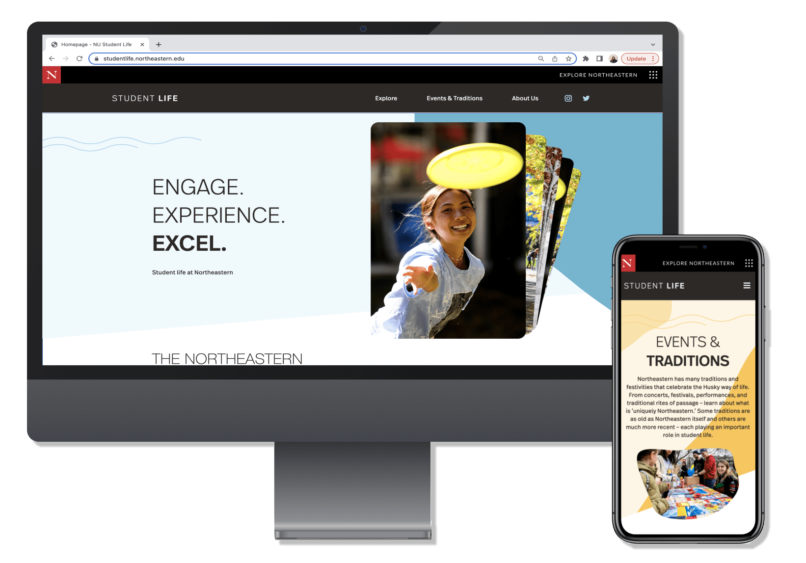
After seeing 10up’s work for Northeastern University departments like Alumni Relations, Student Life approached 10up to design and engineer a revitalized platform suited to host thousands of current and prospective students, and better organize content for parents. The result is the new Northeastern Student Life, an energetic reflection of Northeastern’s student body.
Northeastern University is a private academic institution with a main campus in Boston and other campuses located throughout the United States, Canada, and the United Kingdom. With students coming from all over the globe, Northeastern strives to ensure each student feels connected to the university and their peers and well-equipped for life after graduation.
The university’s Student Life division oversees hundreds of student organizations: from greek life to intramural sports to language clubs. When they first approached 10up, its online identity was outdated and no longer reflective of its student body; the site was also difficult to navigate and lacked accessibility. Northeastern Student Life sought a site that reflected the vibrancy and life of their students, was simple to manage, and intuitive for readers.

Creating a Dynamic & Lively Design
Before settling on a colorful and playful design, 10up presented Northeastern with a wide range of possible aesthetic directions during a Design Alignment Workshop. 10up conducted its Design Spectrum Exercise to discover design goals and preferences before starting the Design Shopping phase, which showcased and explored example websites to hone in on Northeastern’s design tastes.
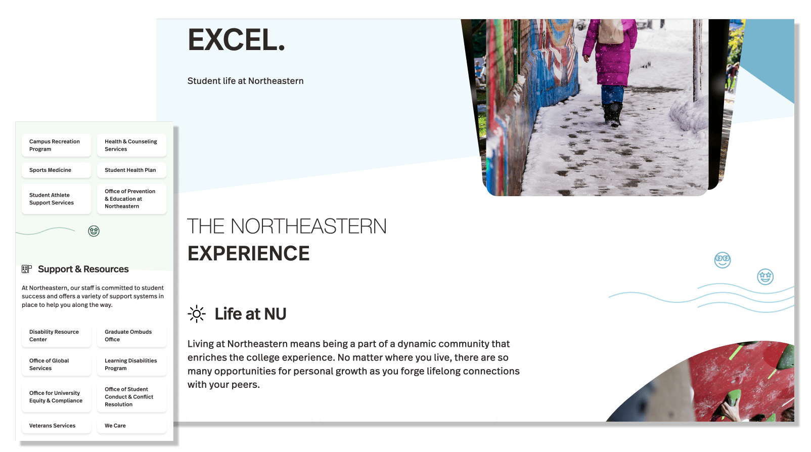
The workshop helped Northeastern stakeholders align around a more energetic look and feel that would reflect the character of their students. Guided by the findings of the Design Alignment Workshop, 10up designed a site with vibrant colors, amoeba-like shapes, and quirky icons. Rather than harsh lines and distinctive sections, the site content and page layouts flow seamlessly and present a youthful aesthetic.
Architecting One Prodigious Block
Bringing the seamless design to life while still making site content incredibly easy to manage required some out-of-the-box thinking.

Because the design’s colors, icons, and images slant across page “sections”, utilizing multiple WordPress editor blocks for each section of a page posed major challenges. Adding or editing content in multiple blocks could alter the placement of colors, icons, or images – across multiple screen sizes, no less – and make the entire page look askew.
10up architected an unconventional solution: engineering a single custom block for each page layout. Within the block, content creators can change photos, add or edit text, and insert additional links, all without altering the page layout. The single block supports multiple design variations for unique, key pages (e.g. Explore, Events & Traditions), avoiding visual monotony while ensuring the site’s design integrity.
Engineering for Efficiency & Quality
To empower 10up’s front-end engineers to focus on pixel-perfecting the carefully-crafted aesthetic while back-end engineers focused on content modeling, editorial tools, and integrations, 10up architected the new Student Life experience using an intermediary data modeling layer.
10up engineers first created a series of data models that described the data the front-end would require. 10up front-end engineers were able to use the model to begin building the site’s front-end while back-end engineers worked independently – with both teams working backward from the data model’s eventual output.
This separation of concerns empowered engineers with focus and independence as they built the site. As engineering drew to a close, this approach also reduced Quality Assurance testing and remediation efforts by limiting the greater likelihood of regressions that building a changing data model “in flight” would have introduced.
Engineering the Small Details
In keeping with the playful aesthetic, 10up designed embellishments that enhance the site’s personality, like small icons of smiley faces, suns, and squiggly lines. Engineered using Javascript and CSS animation, 10up’s little touches include the image gallery “click through” button following the cursor when it hovers over the gallery on the homepage — emphasizing the ability to see more photos. Intricate in detail, the button moves smoothly and drags just slightly, imparting a realistic feel.
These small additions illustrate 10up’s commitment to craftsmanship, and the magic that a strong partnership between designers and front-end engineers can create: making sure each aspect of the site is intentional and adds value to the overall experience for Northeastern Student Life.
Providing the Northeastern Team With Confidence
Mindful that the Northeastern team was not equipped with experienced developers, 10up conducted multiple training sessions throughout the site build to ensure a smooth hand-off. During these sessions, Northeastern was encouraged to make their own edits to the site to build comfort and confidence, and battle test the site.
Furthermore, 10up provided Northeastern with the analytics tools and corresponding training to understand the site’s audience and measure engagement and results. Today, Student Life stakeholders better understand where website traffic comes from and how visitors use the site.
Learn more about 10up’s partnership with Northeastern University in our Alumni Relations case study.

